Prince Rupert Council provides effusive praise for new City logo, brand and direction both will take the community
More than one hundred years of making our wealth by rail and ship and pick and net, the City of Prince Rupert is moving into its next evolution with a new look and a new brand.
And while the way forward comes with a bit of irony in that we have never more than we do today relied on rail or ship more to make that wealth, the move forward towards the future will embrace a number of important elements not considered 100 plus years ago.
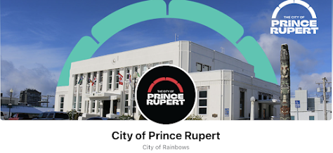
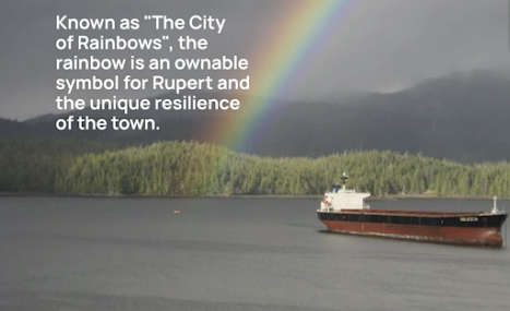
Of main focus for the new vision for the city's image is an incorporation of Indigenous elements and a vibrant Rainbow, one a presence that predates the actual incorporation of Prince Rupert as a city, the other a somewhat iconic Prince Rupert theme that will now dominate all of the City of Prince Rupert's branding and marketing moving forward.
The change as revealed on Monday was embraced with a solid vote of approval from the city Council following a forty minute presentation and comment period at Monday's Council Session.
The Reveal of the new Brand, began with a few words from the City's Communication Manager Veronica Stewart who had provided this report for Council prior to the Monday session.
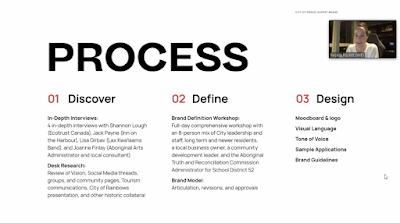
Following her introduction she turned the presentation over to the creative team at Will Creative, who took the council members through the evolution of their two year plus process towards the new look.
As part of that process the Will team engaged with stakeholders and hosted workshops with them and City staffers to realized the finished product revealed on Monday.
Through their commentary, they took council on the journey to the future, staring with the desire of those part of the initial process back in 2019 to create a new image for the community, one which leaves the previous brand and messaging to the past.
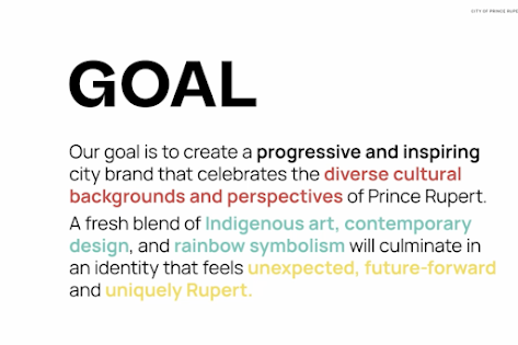
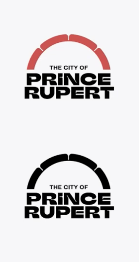
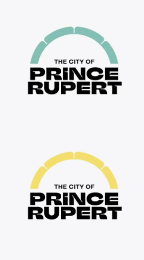
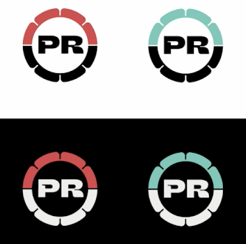
The new imagery was explained as change which will replace the previous look to incorporate a more modern image that engages with Indigenous themes that reflect the community, along with rainbow symbolism that is a representation of the diverse communities found in Prince Rupert, highlighting an image that many associate with the community.
As part of the presentation, the Will group noted of the work with community stakeholders and how the project came out of past vision making exercises in the community
Also in attendance on the evening was North Coast Ts'msyen artist Russel Mather, who had collaborated with the team at Will through the creation process and provided some further input into his approach to the project and how he views the new logo and how it fits into the City's vision.
"This was a unique process for myself too, because with the groups involved, stakeholders, it was very meaningful. We couldn't have the art forms that you've seen on the screen, without that cultural content.
So the art's the identity the cultural content is the heritage part of it. When we set off on this canoe together, I talked about we're going to walk together as one ...
That means we walk shoulder to shoulder, I'm not walking in front of them, or they're not walking in front of and we're going to try to convey everything that came in front of us.
When you get something right, your hearts and your feelings are the same, they beat as one. So for me, this was such a touching piece to be part of ... it was an opportunity and Im glad I was recommended to it ... it's a nice milestone through the pandemic, we worked through it, it was very refreshing. -- Some observations from Ts'msyen Artist Russell Mather on the city's new visual imagery
Ms. Stewart followed up with a few more observations on the two year process to develop the new logo to reach the point of the launch if approved.
"So this process initially started because, we you know we all met during the 2030 Vision process and a lot of what was recommended were physical upgrades, but there was also the recommendation for us to have a more of a coherent aesthetic moving forward. Because that's not something that we have with the current corporate crest, so now we can really see that there are coherent visual elements that we can use in our day to day work" -- Communications Manager Veronica Stewart
When it came to the commentary from the city's elected officials, the Council members were overflowing with effusive praise for the design and the opportunity that it offers the community.
Councillor Adey noting of some ambivalence at the start of the project and how it is now a much more accurate depiction of the cultural make up in the community and how it reflects a community looking forward and not back.
"I suppose I come into it as somebody who's personal background would have found something like this a bit superficial and I'm now find myself feeling that much less ... but here we are and just looking through that presentation and also sort of evolving my thinking through the various sessions we have had during the development of this.
I can really see how this is a much more accurate representation of our culture in the community, the cultural diversity that we have here. I can see how strong it is in how versatile its applications are beyond just a logo on a letter head. It's modern in its conceptual design and I think it makes me feel like we're looking forward rather than looking back, and I think that's where we need to be"
Councillor Cunningham provided similar themes to share his enthusiasm for the new look, noting he had been sceptical at the start but now loves the new look and how its an exciting and refreshing look that everyone can be very proud of.
"At first I was kind of skeptical, but in the end I love it, you know like being a person that kind of identifies with old things, I look at this and I think it's exciting, I think it's refreshing and as Russell says it's a canoe trip that a lot of people went on and I think they all paddled well together and came up with something that everyone can be very proud of"
Councillor Niesh concurred with those thoughts and how the logo had grown on him over time and now as to how he sees it with its different applications for future use.
"I think over time it's kind of grown on me, at first you know I wasn't looking at it from a perspective of all the different aspects where it will be used, and when you see it from you know all the different applications that's where you know it's more grown on me. I definitely felt that we were in need of an update, the logo was old and was not really fitting to who we are now"
Councillor Skelton Morven, thanked all of those involved with the project and noted towards how it can be used in the future.
"I just wanted to thank the team and thank Russell for his submissions and also appreciate our team down south for having a co-creative process and walking alongside one another. I think that's extremely important and very representative of our region that we kind of capture that identity as well"
Councillor Gurvinder Randhawa also shared some thoughts on the project noting of his enthusiasm for the design.
"I think its a great brand and I would like to thank everyone involved"
Both Councillor Blair Mirau and Mayor Lee Brain delivered the most expansive of the comments towards the new look and how they view it as a symbol for the community.
Expressions of support that perhaps make a nod to their pending departure from the municipal scene in October, with the new look one which could be an opportunity for a legacy moment for both that could partially define their time on Council
Councillor Mirau made note of the participation of Mr. Mather and how the new logo is a much better representative and identify of the city from the old logo.
Mr. Mirau spoke to his particular attachment to the concept of the City of Rainbows, looking to head off potential criticism, he noted how Prince Rupert is recognized for the rain and should lean into that and how the rainbow represents much for the community.
"I just want to thank you so much Russell for all your contributions to this project and one thing you just said there, actually completely helped me change the frame of reference I have for this, you said art is identity.
To what Councillor Adey just said this is such a much more accurate reflection of our community than that old corporate seal from the turn of the century.
The city of rainbows has been around as a concept since 1982 but we're really making a brand new identity out of it and the potent symbolism of that is, is yeah art is identity and that's how we want I think to reinforce the metaphor of inclusion and multiculturalism and diversity"
He also, observed to potential push back on the cost of the project and how the City could have spent the money on other areas, noting how the medium and media has changed since 1910 and now the city is dealing with a range of different media and mediums and how the new brand will approach that.
Mr. Mirau also offered up a reminder for Council that the city hasn't upgraded its brand since 1910 and it was time for the community to move past it.
"Graphic design has come an incredible long way even just in the last five years and this is well worth our money. Best practice is to update a brand every seven to ten years, we haven't spend a cent on rebranding in Prince Rupert since 1910 and it shows.
The other point I would make is ... if you want a comparison of other communities that did not decide to put significant resources to try to get it right the first time, you end up spending a little bit of money like the City of Vancouver if anyone remembers that debacle from 2018. Spending a small amount of money and getting a typeface that ended up getting absolutely roasted in the court of publicopinion and they had to go right back to the drawing board because they didn't do a thorough consultation or work with locals in a meaningful way to get something done.
What value do we place as a community on being inclusive, is there a dollar value that we can put on that figure? And when we look at that coat of arms, it's a reflection of a very specific, time a very specific place, a very specific colonial and cultural connotation.
So it's so far past its best before date and it's well past that we moved beyond that"
Mayor Brain also added to the praise for the new look, first thanking the Will team and Mr. Mather, observing as to the journey the rebranding took during the COVID period and came out of one of the first workshop that launched the process.
The Mayor spoke to how the focus was to try and embrace the history of the community, calling it one of the most beautiful things he has seen as a brand, highlighting the areas he found attractive and how it works to develop the Rupert 2030 vision that council has.
"I still remember the conversation was how do we create a brand that bridges both the heritage of Prince Rupert that people traditionally associate it to and the actual 10,000 years worth of history that are here.
And I remember the conversation being going well you know that could be sensitive, that could be, you know we got to be careful. And I remember everyone going no, we're going to be the first to try to actually acknowledge and work towards that.
And honestly what's come out of this is something I think is absolutely ... this is one of the most beautiful things I've seen in terms of a brand"
Mr. Brain observed how the new look and brand is timeless, culturally appropriate and will help to bring the community together and how it represents all and is inclusive of all, noting how he had often noted that he had wanted to see a Bad Ass brand and how this new look reflects that desire.
"My one request only, because I like to not put too much of my input on but was that I wanted something that was a bad ass brand ... and I think this is exactly a bad ass brand right here, this is a bad ass brand"
Mr. Mather further spoke to the opportunity that the new design offers for a new beginning and how he had appreciated the opportunity to be involved with the project.
Council then voted to approve the new brand and logo program.
The cost of the rebranding project is now projected at 105,000 dollars an increase from the original estimate of 2019 that had pegged the exercise ay 75,000 dollars, the report to Council providing for the explanation of that overage.
"Alongside staff time to oversee the RFP and project process, the cost of the project has
been approximately $105,000 total paid for by a dividend from Prince Rupert Legacy Inc.
Costs included stakeholder consultation, consultant travel (early in the project), brand
identity and moodboard development, brand strategy, graphic and artist design, cultural
consultation, and multiple revisions to the guidelines.
The final cost of the project was
higher than the initial $75,000 in funding approved in 2020 due to scope changes to the
project to bring in an indigenous artist, and also project stop/starts due to the pandemic."
You can review the presentation to Council from the City's Video Archive starting at the one hour twenty minute mark.
Following the Council Session the City's communication office launched the new brand through the City's Social Media Stream, the presentation of the new look one which includes a video of the work of Mr. Mather towards his contribution to the process.
While the Council members repeatedly made note of the lengthy process that they and their partners and invited stakeholders were involved in over the last two years developing the new look, the Social Media post has also served as somewhat of a post announcement focus group. With residents taking advantage of their first and really only opportunity to speak to the topic of a new brand and logo for the community.
Council and the mayor have no choice but to heap praise on the logo project because they ok’d the two years to develop it. My take on it the taxpayers just blew $105,000.00 on something that no one ever requested, it's just a dream of this 2030 plan for wasting money. I would like the reader of this to think real hard and describe to yourself the logo for Prince George or any other city you have been too. Can't recall neither can I. They aren't that important!
The logo doesn’t make a bit of difference. Will you feel better paying you high utility bill next year when the new logo is on the invoice letterhead. NO. By the way the utility bill will go up next year also.
This is SO much better than the generic "discover our nature" attempt from the last decade.
Sayward Valley: Welcome to Our Nature Quesnel: it's in our nature Fernie: Wild Nature Lac-Brome: Beauty, it's in our nature Richmond: Discover nature in the city
it's wrong to say the money iss just a logo. either wrong from ignorance, or purposefully misleading.
according to the video the money was also spent on all of those cool graphic design elements, paying local Tsimshian artist Rusel Mather for consulting/design, plus the new branding guidelines and community consultation
if you think it's a waste of money to rid ourselves of a symbol of colonialism and replace it with an Indigenous inspired piece, would you also say that renaming things to Indigenous names is a waste of time and money?
I'm guessing based on your logic here you would say yes. but in both cases, the majority of us know its well worth our time and energy
PS. if you don't think that imagery is important to how we see our community identity, then why ever complain about the state of the downtown? to your logic, i cant describe vancouver's downtown because ive never been there, it must not be important!
The rainbow and colors are great. The font is abysmal. The red and black is bold and can be a bit much, but kind of growing on me. That font though needs to go.
The logo change would be fine if the municipality is awash with cash. Until Prince Rupert has taken care of the basics and gotten the basics to an acceptable level the wish list should be placed on hold. Just look around at the state of the city. It makes me wonder about misplaced priorities of the mayor and council.
Council and the mayor have no choice but to heap praise on the logo project because they ok’d the two years to develop it. My take on it the taxpayers just blew $105,000.00 on something that no one ever requested, it's just a dream of this 2030 plan for wasting money. I would like the reader of this to think real hard and describe to yourself the logo for Prince George or any other city you have been too. Can't recall neither can I. They aren't that important!
ReplyDeleteThe logo doesn’t make a bit of difference. Will you feel better paying you high utility bill next year when the new logo is on the invoice letterhead. NO. By the way the utility bill will go up next year also.
This is SO much better than the generic "discover our nature" attempt from the last decade.
DeleteSayward Valley: Welcome to Our Nature
Quesnel: it's in our nature
Fernie: Wild Nature
Lac-Brome: Beauty, it's in our nature
Richmond: Discover nature in the city
notice a pattern?
it's wrong to say the money iss just a logo. either wrong from ignorance, or purposefully misleading.
Deleteaccording to the video the money was also spent on all of those cool graphic design elements, paying local Tsimshian artist Rusel Mather for consulting/design, plus the new branding guidelines and community consultation
"you pay peanuts, you get monkeys"
if you think it's a waste of money to rid ourselves of a symbol of colonialism and replace it with an Indigenous inspired piece, would you also say that renaming things to Indigenous names is a waste of time and money?
DeleteI'm guessing based on your logic here you would say yes. but in both cases, the majority of us know its well worth our time and energy
PS. if you don't think that imagery is important to how we see our community identity, then why ever complain about the state of the downtown? to your logic, i cant describe vancouver's downtown because ive never been there, it must not be important!
Deleteon a scale of 1-10:
DeleteCity of Rainbows: 9.5
By Net & Pick: 2.5
Discover our Nature: 1
The rainbow and colors are great. The font is abysmal. The red and black is bold and can be a bit much, but kind of growing on me. That font though needs to go.
ReplyDeleteThe logo change would be fine if the municipality is awash with cash. Until Prince Rupert has taken care of the basics and gotten the basics to an acceptable level the wish list should be placed on hold. Just look around at the state of the city. It makes me wonder about misplaced priorities of the mayor and council.
ReplyDeleteI hope the paint they use for the new logo isn't the same paint they use for our crosswalks.
ReplyDeleteWould $105,000.00 paint lines of the streets in this town. I have forgotten what a yellow line or painted crosswalk look like.
ReplyDelete